
COVID and cascading collapses

I’ve been looking at this chart a lot over the past few weeks.

It shows us that print ad budgets were doing just fine all the way though the first decade or more of the consumer internet. There was even a little spike upward for the Dotcom bubble. Then the financial crisis and recession of 2008/9 caused a step change down, but when the crisis was over the budgets didn’t come back. Instead, the market had been reset, and budgets have been falling steadily ever since.
You can see the same trend on a global level in this chart (I’m a big fan of obscure statistics that tell important stories). Global newspaper tonnage was more or less flat from 2000 - it wobbled a bit, but again the collapse came in 2009, and it’s now halved since the peak.

You might call this the Wile E Coyote effect - you’ve run off the cliff, or the cliff has disappeared from under you, but there’s a brief moment while your legs windmill in the air before gravity kicks in. It can take a while for the inevitable to happen, but then, as Lenin pointed out, you get a decade of inevitable in a week.

The Wile E Coyote effect was pretty pronounced at RIM. For some people it was blindingly obvious when the iPhone appeared in 2007 that this was a completely new paradigm for both mobile and computing and that the incumbents - RIM, Palm, Microsoft and Nokia - faced an existential threat. But Blackberry unit sales carried on rising for four years after the iPhone launch - in fact they went up 6x. It took time for Apple to build the route to market and the software features that would let it take over in the enterprise, and time for the market to work that out. Meanwhile, some people lost a lot of money shorting RIM too soon.

The Blackberry collapse was complicated by the fact that it happened in two parts. RIM had started with a high-end enterprise business, and that was then supplemented by a lower-end consumer business, to some extent in developed markets (especially UK teenagers - remember when BBM was a thing?) but also in middle-income markets. So, in the chart below I’d suggest you see first the iPhone hitting the high-end corporate business and then, a little later, Android hitting the mid-range and low-end devices. (Michael Mace, who seems to have stopped blogging, wrote a great post at the time unpicking this in much more detail.)

These two waves show up very clearly in this Google Trends chart (yes, caveats apply). First, BBM users moving to iPhone looked for ‘BBM for iPhone’ - then, a while later, people moving to Android looked for ‘BBM for Android’.

You can see some similar phased collapses in the camera business. There are actually five phases in the chart below:
- Simple consumer ‘point and shoot’ cameras with fixed lenses exploded in the 1970s and took most of the market volume away from interchangeable lens cameras (at the time, mostly SLRs)
- Digital became good enough to make point & shoot cameras in the late 1990s, killed film point & shoot, and created a much bigger market - unit sales went from 9.5m in 1999 to 110m in 2008. This was partly because the pace of change meant people replaced their cameras more often, but also because shooting digital was much more accessible than film
- A couple of years later, digital started to become good enough to do the same to interchangeable lens cameras, and again the market got bigger
- Around 2010, smartphone cameras (and screens and social sharing, which are probably just as important) became good enough to replace point & shoot for most people, and the market collapsed
- And then, again, the same happened to the higher-end a couple of years later.

Where does that that leave us today? We are having a similar kind of external shock to the one that reset the print ad market in 2008/9, and a lot of new services and infrastructure have built up penetration and capability that is not perhaps captured by gravity. And now we’re all forced to try to use all of them. A bunch of industries look like candidates to get a decade of inevitability in a week.
The really obvious one is retail. Everything that the internet did to print media is happening to retail - a lot of retailers, like newspapers or magazines, are fixed-cost bundles that are now being unbundled, and are defended by barriers to entry that are now meaningless. Hence we’ve been talking about the ‘retail apocalypse’ for a year or two now, as the internet reached a level of penetration that made those fixed costs unsustainable and consumer behaviour peeled off more and more of the bundle. This is a ‘boiling the frog’ chart - you can’t see the collapse yet, but…

We all know that this next chart will not look good this year (and it will show a lot of human suffering), but the real question is whether in 5 years it looks like the print advertising chart we began with - except that this will affect 10% of the work force. Is today’s step down followed by a step back up?

There also is a specific American story here, because the US is probably, as the retail jargon has it, ‘over-stored’ - there is far more retail space per capita than in most other developed markets (this is a relatively recent phenomenon). So, this is another chart that may have stored up some inevitability debt.

(Incidentally, I wouldn’t remotely suggest that all physical retail will go the way of print newspapers - there’s vastly more variation in the model. But retail sits on a continuum from logistics to experience, and the internet changes all the logistics calculations.)
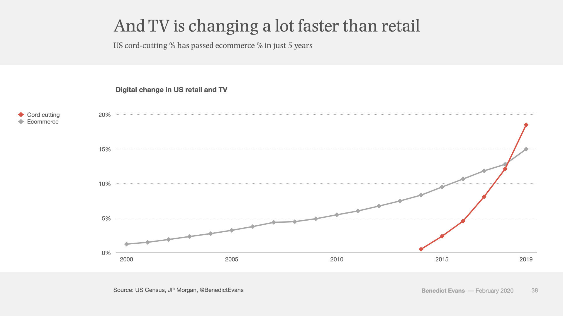
The other obvious question has been about TV. Here, the US model finally started unlocking five years ago, a decade after Youtube and Hulu launched.

This change is happening a lot faster than retail.*
Where TV viewing is now moving, the TV ad model has seemed to be storing up its inevitability for the future. So far, the internet has failed to offer TV advertisers a substitutable product in the way that happened in print - does that change, and does it matter? As an ad agency head put it to me a couple of years ago: ‘subscriptions are down and viewing is down, but budgets are flat, so CPMs are up’. I am neither a TV analyst nor an advertising analyst, but observations like that tend to end the same way. So, what does this chart look like in 5 years? How much long-term structural change is being catalysed now?

Finally, it’s fascinating to compare the impact of the internet on the overall ad market to the impact of TV, the last new form.

It would be easy to look at the replacement of print share with internet share (over half of which is Google and Facebook) and presume that the money just moved across, but isn’t really what happened. Something over two thirds of Google and Facebook ad spend is from advertisers that were never in traditional advertising at all, or perhaps only the Yellow Pages or local radio. And meanwhile, if you look at this as a share of GDP, you can see the there is another kind of shift in spending going on. The ad market reset in 2008, and the visible part is the money leaving print, but the most interesting part may be the money that’s not captured in ‘advertising’ at all.

* This chart is also a lesson in how changing the time span changes the story.
Benedict Evans is a Venture Partner at Mosaic Ventures and previously a partner at A16Z. You can read more from Benedict here, or subscribe to his newsletter.